After the icon, screenshots are the only thing.
On the App Store, the icon earns the tap into the listing. After that, the title and subtitle carry maybe a beat of attention. Then the screenshots run — and the first one or two do the bulk of the conversion lift.
The best apps treat the screenshot set like a six-frame storyboard, not a feature dump. This guide reverse-engineers one that works — Talkspace — and abstracts the template you can ship against.
Six frames, six jobs.
Talkspace ships an alternating calm/bold rhythm. Frame 1 carries the breadth and the social proof. Frames 2, 4 and 6 read calm (light mint, dark serif). Frames 3 and 5 are loud orange breaks that wake up the scroll. Every frame has exactly one job.
Browse the full inspirations gallery on the Talkspace page or jump into 4000+ more examples.
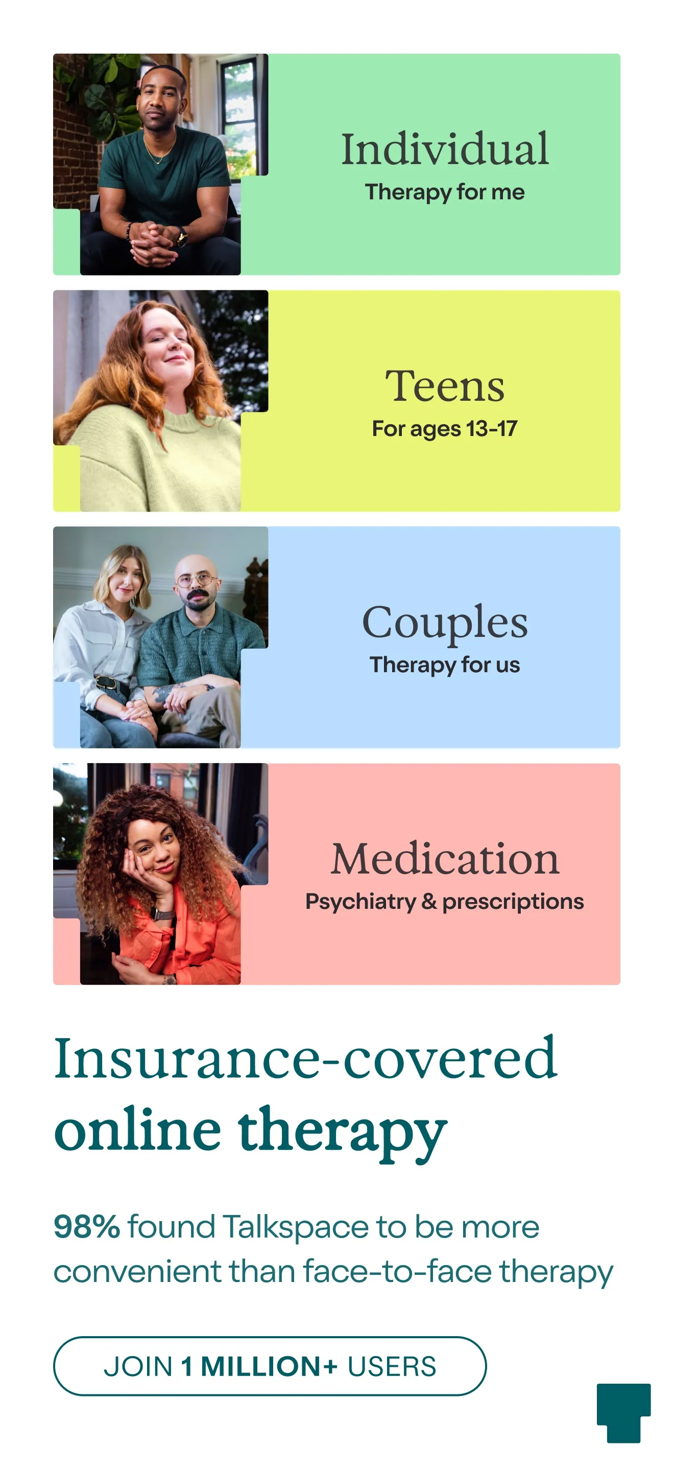
Insurance-covered online therapy
Four audience bands (Individual, Teens, Couples, Medication) prove the app fits anyone, before the value prop is even spoken. A 98% stat and a 1M-users pill stack two trust signals on the strongest frame.
- Stacks the audience: shows you who the app is for in one glance.
- Quantified social proof: "98%" and "1 million+ users" — both visible at the fold.
- Insurance line addresses the #1 download blocker (cost).
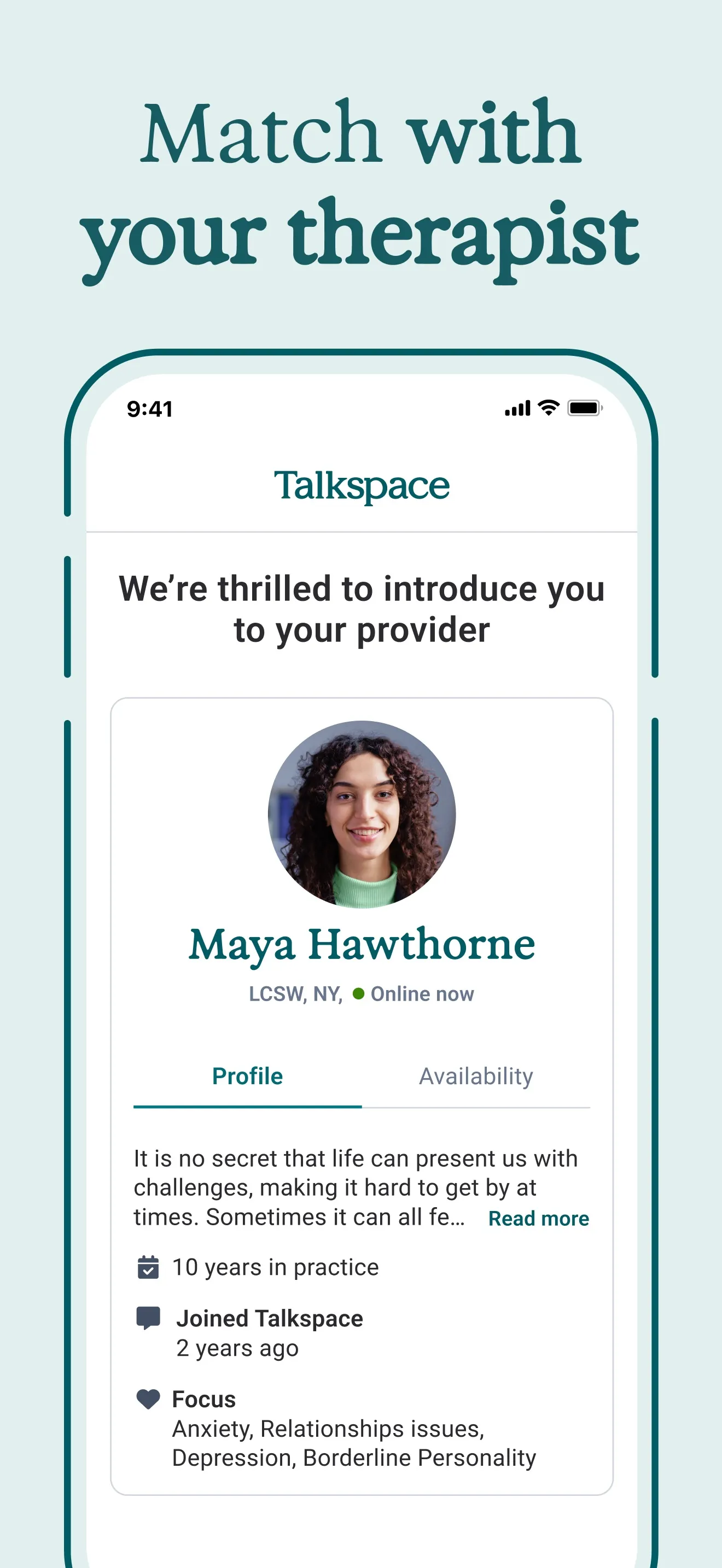
Match with your therapist
Real UI screenshot of a therapist profile. Name, credentials (LCSW, NY), online status, focus areas, years in practice. The reader sees what they are buying.
- Real human-faced profile beats a stock illustration every time.
- Credentials in plain text (LCSW, 10 years in practice) lift conversion among skeptical buyers.
- "Online now" indicator signals immediacy without a separate copy line.
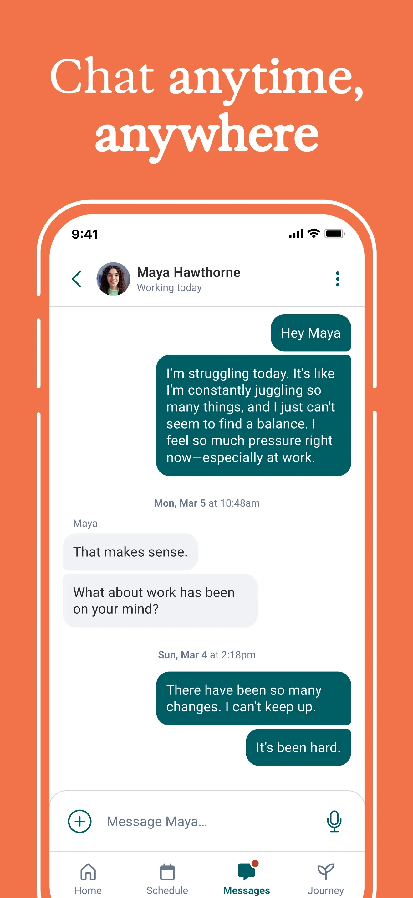
Chat anytime, anywhere
A bold orange break in the rhythm. Real chat UI with a vulnerable user message and a warm reply. Sells asynchronous, low-friction support.
- Color break wakes up the scroll — alternating calm and bold prevents fatigue.
- Authentic-sounding message ("I'm struggling today") makes the use case concrete.
- Bottom nav stays visible, showing Home / Schedule / Messages / Journey — the app is more than chat.
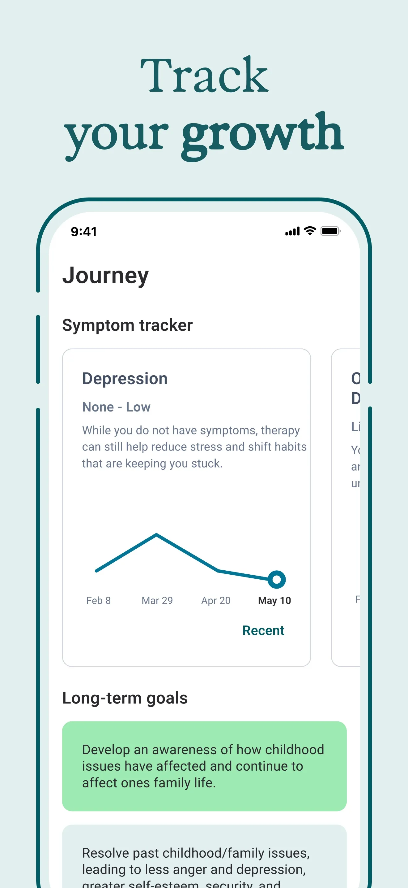
Track your growth
A symptom chart trending downward across three months. The before-and-after is implicit. The reader sees the result of using the app, not just the features.
- Trending-down chart on Depression = visual proof you'll get better.
- Date axis (Feb 8 → May 10) makes the promise concrete, not hand-wavey.
- Long-term goals card hints at depth without crowding the frame.
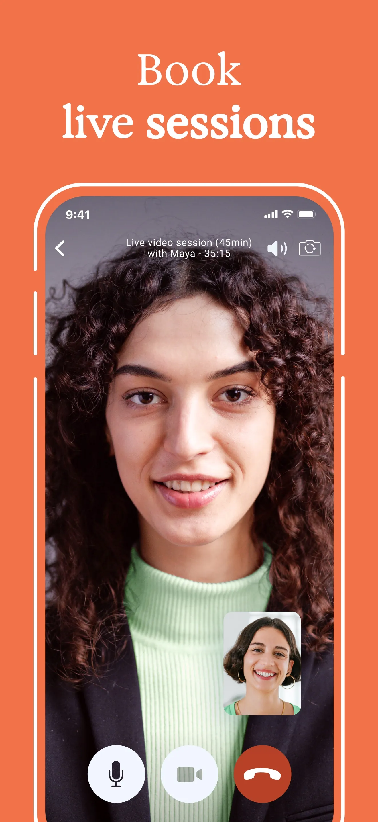
Book live sessions
Another bold-orange break. A full-bleed live video call. Tells the reader chat is not the only mode — high-touch live therapy is here too.
- Second color break keeps the rhythm — every 2nd frame is loud.
- Wide-shot of a real face creates instant emotional resonance.
- Mic / video / end-call icons match the FaceTime mental model — no learning curve implied.
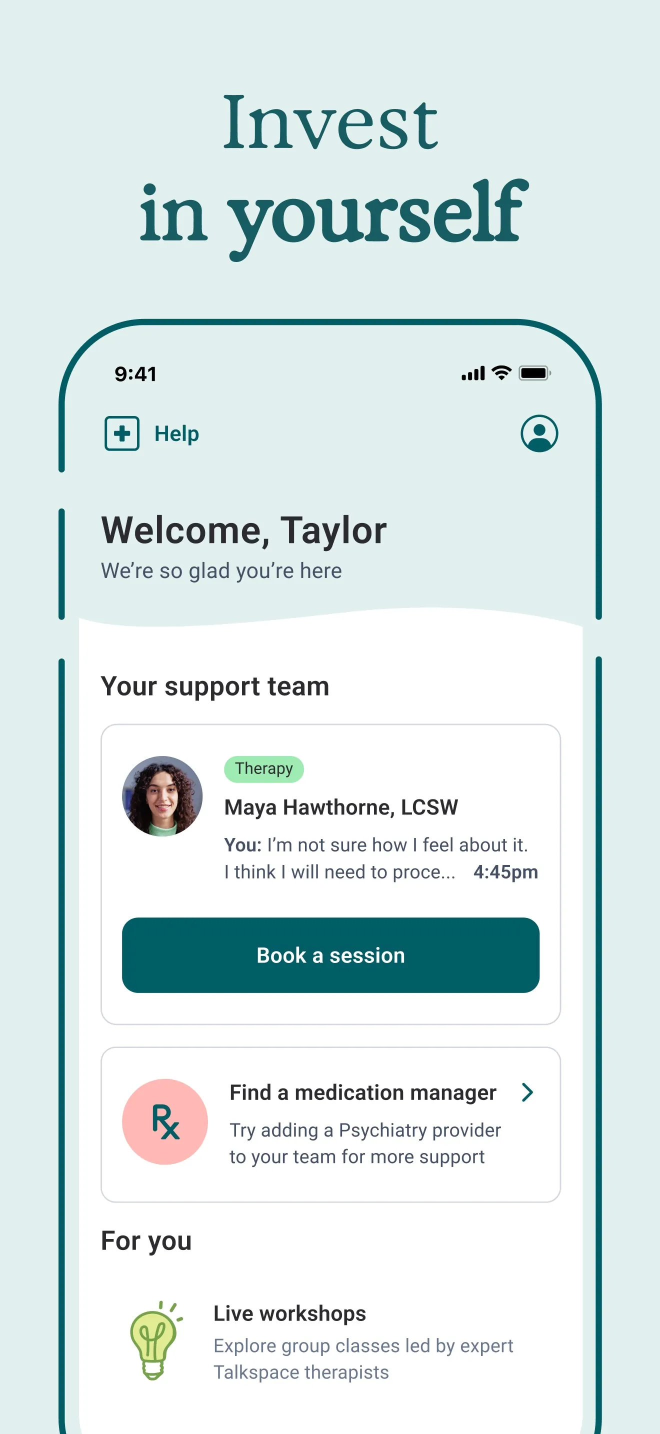
Invest in yourself
Home screen post-signup. A primary "Book a session" CTA sits at the centre of the frame — the same action the App Store "Get" button leads to. The whole flow is visible end-to-end.
- Personalised greeting ("Welcome, Taylor") signals the app remembers you.
- Single, high-contrast "Book a session" CTA mirrors the conversion goal.
- Secondary card ("Find a medication manager") demonstrates upsell room without pushiness.
Six frames, six jobs — abstracted.
Strip the Talkspace teardown of its specifics and you have a template. Six slots, six jobs, in order. Fill them with your app and you have a draft to refine, not a blank canvas.
- §01Hero
Breadth + social proof
The strongest stat or audience claim you have. The App Store crops this frame above the fold of search results — it does 60–70% of the work on its own.
- §02Trust
Who delivers it
Show the person, the credential, or the brand that backs the promise. Real UI, real text, no illustration placeholders.
- §03Convenience
When it fits your life
Daily-use moment. The frame that answers "will I actually open this?". Break the visual rhythm here — different background, louder contrast.
- §04Outcome
What changes for you
A chart, a streak, a before/after. The reader needs to picture themselves on the other side of using the app.
- §05Premium
Depth the lurker missed
The advanced or paid surface. Another visual break. Tells store browsers the app is more than the obvious.
- §06Onboarding
Day-one feel
What the user sees thirty seconds after tapping Get. The in-app primary CTA should be visible — it primes the install.
Write the headline like a billboard you pass at 60mph.
Talkspace runs Match, Chat, Track, Book, Invest. Five verbs. Each frame asks the reader to do one thing.
Verb-led, 2–4 words
Match. Chat. Track. Book. Invest. The reader is swiping at scroll speed — the headline has to deliver the entire frame in a single beat.
One headline per frame
Never stack a headline and a subhead at the same weight. If you need both, push the subhead to 40% of the headline size and ink it down to muted.
Avoid feature names
"Symptom Tracker" is the feature. "Track your growth" is the headline. The first describes the screen; the second sells it.
Keep the brand voice consistent
Same serif (or same sans-serif) across all six frames. Same case. Same colour. The headlines read as one campaign, not six unrelated shots.
Alternate calm and loud.
Talkspace runs four calm frames and two bold-orange breaks, alternating like a heartbeat. The eye is most likely to abandon the scroll when every frame looks the same — the background flips wake it back up.
The rule is not orange-and-mint specifically. The rule is contrast. Pick a calm base and a loud accent, and place the accent on frames 3 and 5 — the moments the reader is most likely to give up.
Stack at least three on the hero frame.
The hero frame does 60–70% of conversion work. Load it. Talkspace stacks four trust signals there — audience breadth, a 98% stat, a 1M-user pill, and the “insurance-covered” line.
A quantified stat
"98% found Talkspace more convenient". "1 million+ users". "4.8★ from 37k reviews". One number beats a paragraph of adjectives.
Real credentials
Show the LCSW, the certification, the press logo, the integration name. Anything a skeptical buyer can verify in five seconds.
Real product UI
Mock UI looks like a startup pitch deck. Real UI — with your actual fonts, spacing, statuses — looks like an app worth installing.
Outcome, visible
Chart, streak, savings tally, completed task list. A picture of the after-state lifts installs more than promising it in words.
Show the in-app primary button. It reaches across.
Frame six on Talkspace shows the home screen with “Book a session” as the dominant in-app button. That button visually rhymes with the App Store “Get” pill the reader is about to tap.
The screenshot is doing two things at once: previewing what happens after install, and priming the install itself. The reader sees their first in-app action before they tap Get.
Six ways the screenshot set silently dies.
- Filling every frame with the same flat brand colour — no rhythm, the user stops scrolling at frame 2.
- Decorative mock UI that doesn't match what users will see after install — the App Store reviewer will flag the mismatch.
- Two competing headlines stacked at equal weight — the reader picks neither.
- Burying the social proof on frame 4 — by then 70% of viewers have already left.
- Same iPhone resolution exported for every device — accept the device-specific export and let the store render at native pixel density.
- Skipping localized screenshots — translated stores convert significantly higher than English-only screenshots shown to non-English speakers.
Frequently asked questions
How many App Store screenshots should I ship?+
Apple shows up to 10 portrait screenshots per locale. Six is the sweet spot: enough room for the six-frame template (hero / trust / convenience / outcome / premium / onboarding) without diluting the message. Beyond eight, viewers stop scrolling.
Should the headline live inside the phone frame or above it?+
Above. The headline carries the frame's job — putting it inside the phone frame makes it compete with the real UI inside. Talkspace, Calm, Headspace, Duolingo, Notion — all the high-conversion teardowns share this rule.
Do I need to design separate screenshots per device size?+
Apple requires at least one set at the largest iPhone size (6.7") and accepts the same set scaled for smaller devices. lokal exports the four real device presets (iPhone 6.7", 6.5", iPad 13", 12.9") on the export step — see the guide for the full list.
How important is localizing screenshots vs translating just the listing copy?+
Apple's own ASO research shows translated screenshots drive 20–30% more installs than English-only screenshots for non-English locales. The listing copy moves the needle, but the screenshots are what the viewer actually scans before tapping Get.
What if my app doesn't have a 1-million-users stat to put on the hero?+
Use what you have. A press logo bar, a 4.8★ rating, an integration partner ("Works with Apple Health"), or a single-sentence customer quote all act as the social-proof slot. The frame is a container — fill it with the strongest trust signal you own.